
Nielsen’s Data Comparing Cable TV Viewing to Streaming is Flawed and Misleading
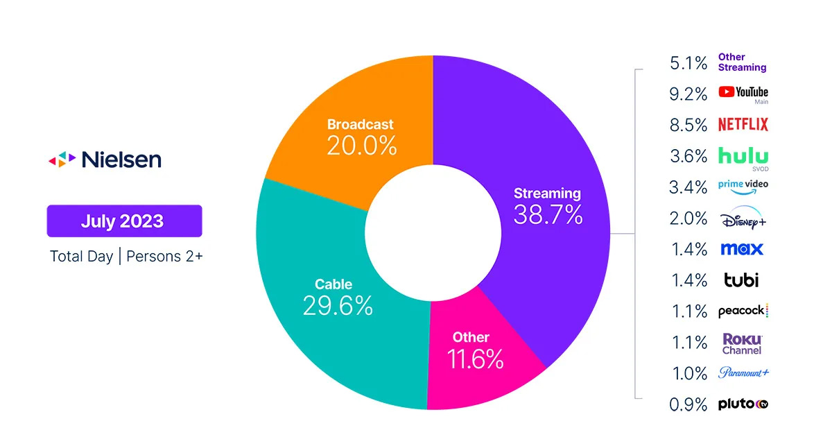
It’s sad that most major media outlets run stories with dramatic headlines saying, “In July, linear TV made up less than half of all TV viewing, according to Nielsen,” without questioning the data or how the word “linear” is being defined. Nielsen’s latest comparison data of cable TV to streaming viewing is NOT apples-to-apples and their methodology isn’t clear or transparent. But most in the media don’t care as it plays into their goal of wanting to call pay TV dead, something they have been saying for more than five years. Spoiler, it’s not dead.
Nielsen’s terms are so broad and undefined as they use phrases like “TV usage”, which isn’t clearly defined. TV is a device, it’s not a “type” of viewing. Later they use the term “broadcast viewing”, but you view broadcasts on TV. They also use the term “cable viewing”, which is a type of delivery mechanism to deliver the video. Nielsen provides no details of what devices are being measured for streaming usage and includes FAST channels, which as presented, is the same as TV viewing. It’s linear channels.
Nielsen is lumping in the method of delivery (streaming, cable, satellite) with the business models, (pay TV, AVOD, SVOD, FAST) and then ignoring some services completely like YouTube TV, Hulu + Live TV, and Sling TV, without any explanation as to why. In their “other” category they say that, “Streaming platforms listed as “other streaming” includes any high-bandwidth video streaming on television that is not individually broken out.” What is defined as “high-bandwidth video streaming?”
There is zero transparency in Nielsen’s methodology and definitions and yet the streaming industry and the media continue to use it to help propel the notion that anything that isn’t streaming-related isn’t a viable business anymore. Sadly, the industry doesn’t push back on Nielsen, question the data, and demand transparency because they only care about pushing the agenda of “pay TV is dead”, which Nielsen’s pie charts supposedly prove.
No one seems to care about the methodology of how data is collected or the accuracy of what is being compared and that’s a step backwards for the industry.